Thursday, 6 December 2012

Props Needed

My thriller opening is based on a chemical explosion that takes place in a laboratory. Given that, I will need certain things [props] for the opening.

PROP LIST

  • sheets of paper [to be strewn across the room]
  • various beakers, conical flasks, graduated cylinders, and volumetric flasks
  • lab coats
  • pads of paper
  • pens and pencils
  • various coloured liquids [water with food colouring]

Needed for Special Effects:
  • a bucket or two
  • liquid soap
  • access to water
  • methane
  • a pack of matches or a lighter

Credits & Fonts from dafont.com

My original idea for my thriller opening is to have the main character have rolling blackouts with the credits being shown in between consciousness i.e. names and jobs on white background. I'm staring to rethink that as I look at fonts I could use.

Font Ideas

1. Have a Sci-fi themed font for the film title while it appears on a lined piece of paper as if it is a piece of paper used to document the 'experiment'. The following pictures are from dafont.com under Techno < Sci-fi. I really liked the look of Neuropol to possibly use for the thriller opening. Magmawave is interesting but it reminds me of cats. The photo of the variety of fonts all interested me in different ways so I took a group photo.


2. Another idea was to use a distorted font for the title since it is a thriller opening. Without realizing it, I had clicked on 'Destroy' as the sub-genre. I wound up finding some fonts that I liked anyways. These were some of the possibilities I saw on the website under Fancy < Destroy.


3. The final idea I had was that instead of having the credits in rolling blackouts, I could have the names on ripped sheets of paper strewn across the room from the 'explosion'. It would be something like the Delicatessen's opening sequence and how there is a track on various items with credits on them but just sheets of paper. In addition to that, different people's names and jobs would be in different handwritten fonts. It would seem that in handwritten fonts, I like almost all of them.

Boys Handwriting


Girls Handwriting


Wednesday, 5 December 2012

Road to a Thriller

Things to Do:


  1. Take a picture of Rm 28 (Chem lab)
  2. Buy Duracell batteries for digital Canon
  3. Talk to Chem teachers about using Rm 28
  4. Buy eyeliner for make-up
  5. Ask about making room look 'messy'
  6. Make a Contingency Plan
  7. Post 'Methane Bubbles' video
Explanations
  1. Took picture of Chem lab after school on Monday
  2. Bought batteries for camera yesterday
  3. Spoke to Chem teacher and Lab Technician about using the lab--available after school for use
  4. Yet to buy make-up--make mental note (or actual note) to buy some
  5. Chem teacher and Lab Technician said that it was alright to make room messy but have to clean up afterwards
  6. Contingency Plan posted
  7. Uploaded methane video with pictures of Chem lab in a combined post

Thriller Additions--Special Effects & Location


This is a video of a teacher and a lab technician who were kind enough to show me 'methane bubbles'. In the bucket on the floor is water with soap so bubbles can be formed. Methane is then pumped into the bucket and starts to make methane bubbles. When lit on fire, it explodes in a burst of flame. It is quick, slightly dangerous but would be really cool to have in my thriller opening. Pardon my filming: near the end I forgot that I was using a phone camera and I turned it sideways. I also said "Oh my gosh."

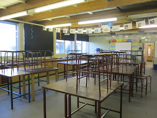
These are pictures of Chemistry lab, room 28 in the lower school building. This is where the above video was shot and where I wish to shoot my thriller opening sequence. It is spacious, has table tops and does not constrict people to rows of desks like the other Chemistry labs allowing the cast and crew access to all of the room.


Contingency Plan

In the event that something were to go wrong with my thriller idea and I was unable to go through with either the location (of a school's Chemistry lab), the cast, crew, etc, I must have a contingency plan. A contingency plan is a back-up plan that a director/producer would have in case something goes wrong.

My Contingency Plan:
(Everything here refers to an alternate option)

Location: A different Chemistry room, if unable entirely then I would have to use a room in the Town Hall and set it up to look like a Chemistry Room.

Equipment: Original plan was to use my own digital camera (a Canon) and to have spare set of batteries on hand in case they were to die on me. If, for some reason, my camera were stop working I would have to ask to borrow a camera from Media Studies. It's a given that I would have to ask to use a tripod to steady it. In the event that my camera does not fit the tripod I would try to fix it to a  plank of some sort and fix that to the tripod. It is rather important to have one.

Cast: I have asked 9 people to be my cast but if they were unable to partake in my thriller opening, then I would have to ask another set of people. Preferably, I would choose people that have similar study periods (frees) as me so that communicating to all of them would be much easier compared to hunting down different people at different times. In addition, I could always ask people in boarding at Thomas Adams to act in my thriller as well since we all 'live' at school and are therefore always here.

Editing: This part is extremely delicate as I am still getting used to using Mac's. Either way my filming goes I am getting help from other students and the teacher to put it together. I will try by myself, I'm not the kind to get people to do everything for me.

Props: This area is fairly crucial to the thriller opening. I am going to need conical flasks, volumetric flasks, beakers, and graduated cylinders in order to make it look real. These props are vital in order to achieve a 'Chemistry lab' appearance.

In conclusion, some things are very important to this thriller opening and cannot be 'unavailable' in order to have the proper effect of a sci-fi thriller.

Sunday, 2 December 2012

Audience Research-Films & Interviews

There are several things to consider when making a movie regarding your audience. You need to know which audience you play to, either men or women; ages, young children; teenagers and young adults, 25+, 35+, 45+, etc. Then, after learning this information, you need to accommodate the other gender since discriminating is not an option and make it appealing to them as well. Dr. Cliftlands had mentioned that was the reason why thrillers, which are mostly viewed by men have a romance intertwined to attract women to watching them.

1. Examples

Iron Man-In short, main character, Tony Stark creates [Robert Downey Jnr.] a 'super suit' that makes a ruckus amongst the other characters specifically Obadiah, a business partner of his late father's-the main conflict in the film.
This movie grossed about $318.5 million domestically on a budget of $140 million. For a comic book adaptation, it was ranked 7th overall, nominated for 2 Oscars, and 45.6% of its income was on foreign income.
I'd say it did pretty well.

Avatar-This movie is about a man who is sent to another world in order to gain the trust of the inhabitants and help the human race take over but is conflicted when he starts to fall in love and connect with the people. This movie was the fastest film to ever make 1 billion dollars replacing director James Cameron's Titanic.

Inception-This film is about a thief in the future who is given a chance to redeem himself by entering the human mind through people's dreams. It stars Leonardo DiCaprio while being directed by Christopher Nolan. It won 4 Oscars, 83 other awards, and was nominated 103 times. Its overall domestic sales were about $292.5 million

X-Men: First Class-This movie is the prologue to the rest of the films in the X-Men saga. It explains how Magneto and Professor Xavier came to be enemies, how Professor X started a school and eventually got disabled, and generally introducing the characters and scenarios seen in later films. It was directed and partly written by Matthew Vaughn. Total worldwide sales for this movie were 353.6 million dollars. It was released on June 3, 2011.

Battleship-This film is about a U.S Navy fleet that encounters and battles unknown extraterrestrials in Hawaii while having a training exercise there. It was based loosely on the popular board game. This film did not do very well domestically making only $65 million but was fortunate enough to have done much better internationally making $237.6 million allowing to surpass its $209 million budget. It was directed by Peter Berg and written by brothers Erich and Jon Hoeber.

Captain America: The First Avenger-This film is theoretically the first film that makes up the Avengers Assemble even though it is one of the more recently made movies. It stars Chris Evans as Steve Rogers/Captain America with Joe Johnston as director and Christopher Markus and Stephen McFeely. This movie was produced by Paramount and grossed $368.6 million worldwide.

2. Interviews


Scott H.
Why do you like Thrillers?
-They are exciting, mentally stimulating, cool.
What kind of thrillers do you watch?
-action thrillers, horror thrillers
What do you like to see in your thrillers?
-action, explosions, fighting, mystery, suspense, bad-ass characters [Samuel L. Jackson for example]

Do you like Thrillers?
Yes.
What kind of thrillers do you watch? {Action, Horror, Mystery, etc.}
All three combined.
Do you have certain expectations of thriller films?
To be thrilled.
Do you have certain actors you like to see?
Liam Neeson and Jude Law.
What feelings do you get when the film is over?
Satisfaction and disappointment that it is over.
How can you tell if the film was good or not?
If the acting was good, the film was good, if there's a good screen play. If it has a predictable story line (a negative thing).


Do you like Thrillers?
Yes.
What kind of thrillers do you watch? {Action, Horror, Mystery, etc.}
 Action.
Do you have certain expectations of thriller films?
Got to have suspense and keep you wanting to watch it.
Do you have certain actors you like to see?
No, I don't care really.
What feelings do you get when the film is over?
I might want to watch it again, or watch other thrillers, others in the same genre or watch sequels.
How can you tell if the film was good or not?
If I like it or don't like it. Not knowing what's going to happen next--the suspense of the film.

 
Do you like Thrillers?
Some of them, yes.
What kind of thrillers do you watch? {Action, Horror, Mystery, etc.}
More mystery.
Do you have certain expectations of thriller films?
Not really because it's a mystery, the ending could be anything.
Do you have certain actors you like to see?
I don't really mind the actors in general.
What feelings do you get when the film is over?
Ususally, I'll be a bit surprised but nothing special.
How can you tell if the film was good or not?
 If you can tell that there was a lot of effort put into special effects, if they get really good actors, if the set was well prepared. Generally if there was good money put towards the movie, you can tell.

Friday, 30 November 2012

Company Logo and Progress Picture


 This is the original prototype that I made in class with one of the teachers. He had brought in some images off the Internet for us to mess around with and see how we could use different images and overlay them in order to have a final picture as our 'company logo'. The example name used was 'Fish Eye' and I really liked the product I had made so I decided to keep it and eventually use it.


This was the first step I took towards actually making my logo. I saved and put my images into Adobe Photoshop and then opened them both. I took the image that was to go on top (the starfish) and used the 'magic wand tool' on the left hand side to cut out the image from its background. From there I needed additional assistance from the teacher to alter the background of the cut out starfish so that I didn't copy a black background with it onto the beach image.


This image is of the nearly finished logo. By this time, I had put the image of the starfish on top of the image of the beach but was trying to find the right font. Luckily for me, the font tab in Adobe Photoshop shows you a sample of letters for each font. I started from the top with 'A' and saw it pretty quickly. When I found the correct font, I had to choose the font colour. I realised that I couldn't use black since the edges were black and it wouldn't show up so I used the next best thing: white.


This was the final product: polished, finished, and ready for use. I am really proud of the end result. Needless to say for me, none of this was done without assistance. Again, I'm still unfamiliar with Mac Books and how the applications work but I'm getting there.


Monday, 26 November 2012

Risk Assessment

If this were a real production, as in I were to making a real movie, I would have to do a risk assessment which is basically an official piece of paper noting all possible risks and hazards, and how to prevent or avoid them. We used Riverside TV Studios' risk assessment form.


Wednesday, 7 November 2012

Experimenting with Double Vision

This is a video clip that was used to show me how to make double vision a reality because I am not a master of Final Cut. In actuality, the only thing that I did in this was videotape Sam (the boy in the clip) asking me if I was alright. Don't be fooled by his seemingly helpful appearance, it was scripted.
In the end, I probably still need to do another experiment with Final Cut because I'm still not sure exactly how to operate it yet. In time, audience; in time.


Tuesday, 6 November 2012

Scanned Storyboard Pages and Edits

As required of us students who choose to do Media Studies, a storyboard of our mini-film (actually an opening sequence) is needed to show how our knowledge of how films are made. So now I give you: my storyboard not without many flaws.

PAGE 1.
-Every time I had put 'Mid-size' as my shot size, I had meant to say mid shot or medium. There is no 'mid-size'
-In the 2nd shot, my mid-size should actually be medium long shot
-In the 3rd shot, again, mid-size should be medium long shot


PAGE 2.
-1st shot is not a close-up, it is a medium long shot
-I have been advised to separate my actors' names and interlace them with action shots
-4th shot would not be a close-up, it would be a medium shot only because the person is sitting down


PAGE 3.
-Using my new-found knowledge, the shot size is a medium shot moving into a long shot because the camera pans across the classroom [set]
-The shot of the ceiling may or may not be a long shot. It could be a very long shot but I'm not sure yet since I do not posses a video camera


PAGE 4.
-The 1st shot should be noted as a medium close-up, not a close-up
-The 2nd shot does not have a shot size, it should be medium close-up moving into a long shot since the person is standing up and it is a POV shot
-Note that in the 3rd shot, the effect of 'double vision' is being used. This will require me to learn how to do this on Final Cut
-4th shot I corrected it to be a big close-up
-5th shot is a medium close-up


PAGE 5.
This page needs more action shots in between the credits.
In addition, more production team credits.

Tuesday, 23 October 2012

Possible Production Co. Logos

Here lies some logos of 'Fish Eye': the fake production company name that was made up by one of my teachers for this exercise of making our own visuals. I really like the last one because it could be used for any kind of movie similar to MGM or Universal. It also looks cool cause it has a fish bowl effect. the third one is my second favourite simply because I did  really good job cutting out the eye.


Monday, 22 October 2012

Thriller Progress RE: Shooting Locations

So, in the process of making a thriller I realize that we are our own location scouts in addition to being our own directors and everything else under the sun. No problem. These were some possible locations I found of shooting a 'sci-fi thriller'.

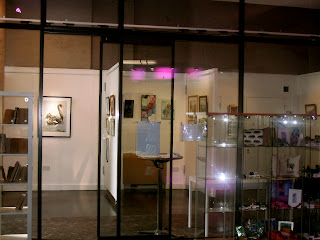
The local art gallery from the outside
I was thinking that having a science experiment in a glass room would be a cool idea. Nothing more. Oh, it was spacious as well as you can see. An idea I had in mind was to have broken glass everywhere from 'the explosion' but I hadn't thought it all the way through yet.
The local art gallery from the inside


Further along, outside the town hall I found an empty store (as in not being used for a store). I thought this could be a good location for my thriller because a) it wasn't in use and b) it seems like it would be of good use for a fake laboratory. To be honest, I don't have the highest standards for a set. Below is a picture of what I could see of the inside. Since it was an unused property, it was locked.

I seem to have a knack for finding unused properties because I found another one. For the record, this is a very small town. This one however was obviously meant to be something nice as it had a front door with nice floors.


At this point I think I got a bit desperate or bored in my pursuit of a location for my thriller and I wondered where can I find an open, available space. Wrong question. I realize now that I can't exactly shoot a lab experiment outdoors when it's an indoor thing.


This open lot was no better.


Alright, this was supposed to be a picture of an empty indoor space that is a definite contender. Basically, when I took the picture there was some yoga/pilates/physical wellness class taking place so I wasn't allowed inside. If it wasn't for that, I'd say that it was almost perfect.

Ultimately if I had a choice, I would pick an actual chemistry lab as my thriller set borrowing items from the science dept.

*fingers crossed*

Tuesday, 16 October 2012

Plagiarism and It's Consequences

It is wrong. Do not do it.
If you do, I will find you.
You know who you are.
 
You have been warned.

Thriller Setup RE: Thriller Ideas

It was suggested to me that since I really like Science and will eventually study it further, that I base my thriller opening on something science related. I agreed, so here we are:

  • Fade in from white screen
  • An explosion has taken place in a Chemistry lab
  • Fade out to white again
  • Production co. and logo
  • Fade in
  • Camera is on the brink of being in focus
  • Girl screaming at dead bodies and people on the floor
  • Cut to dead body on the floor
  • People's clothes torn and burnt
  • Fade out to white
  • Main characters names appear in plain font
  • Fade in
  • People in various stages of waking up
  • Camera pans room [POV shots]
  • Camera looks up at light fixture
  • Light acts as fade out translation
  • Director's name
  • Movie Title
  • Fade in
  • Various people on the ground obviously not getting up
  • Someone tries to wake person [self]
  • Pulls person to their feet
  • Sees person trying to save recorded evidence
  • Someone else says 'Leave it alone, it's not worth it!'
  • Smoke in the air
  • Multiple images swim in vision [dizziness]
  • Broken windows are seen
  • Fire is seen on counter tops
  • Fade out to white
  • Co-starring

  • Camera is diagonal [45 degrees off] **called a Dutch Tilt**
  • Gives effect of being off balance
  • No music is playing
  • Sounds are of surroundings
  • Technique: all sounds seem as if under water [explosion affected ears]

Sunday, 14 October 2012

Vantage Point-Watch the Titles

I have never seen Vantage Point but been told enough about it to get the idea. The title sequence given is very short, less than a full minute. In truth it's only about 51 seconds of an actual opening, the last 6 seconds are a plug for a website. Either way, valuable stuff was seen that could be used.


1. REPRESENTATION-One thing I noticed straight away was that the opening sequence [if you choose to call it that] was seen through the angles of the letters in the title of the movie. E.g. seen through the corners of an 'N'. I thought this was smart because the movie is entirely based on the 'vantage points' of a group of people who saw an important political figure get shot. In my opinion, portraying your movie in the opening sequence in a creative way takes a lot of skill.


2. TECHNIQUE-While looking through the corners of letters, various scenes were seen at once. It was an overlay of 2-3 different scenes all playing at once. Incorporation of still pictures were used as well. When reading this, it may be a bit confusing as to why and how multiple things can be seen and understood at the same time but the key was to have similar looking scenes play simultaneously. E.g. to have the image of a car rolling down the street with an overlay of the same car parking itself at the inteded destination. In theory, this could be why it was so short but if used properly it looks really really nice.


3. COLOUR-The colour palete for this title sequence was sepia. Everything seen out of the letters was either shades of old-school brown or black. This gave it an older, more antique feel as if it happened in the past. The effect brought forth the image of the JFK assination. The one thing for me is whether or not this movie takes place in the past. I cannot recall from descriptions told if it was a modern film or not.

X-men: First Class-Watch the Titles

I personally Love with a capital 'L' this movie series and I think this movie in particular was fantastic. The only opinion that matters in this in mine. I don't mean to be selfish and egotistical but nothing could dissuade me from my feelings so I am happy to analyze this for media studies.


1. COLOUR-The whole 1:52 mins is done on a black background. A very dark, yet no nonsense style appropriate for the film. There are no background images, no shifting of any kind, no additional colours other than black. The simplicity helps in its attempt to be a prequel to the other X-Men movies. Having a single colour that never changes, especially black [the other option is white], makes it feel like an older, minimalistic movie.


2. VISUALS-In the title sequence you see what appears to be the movement of genes, DNA strands, amino acids pairing up, double helixes, genes multiplying, and something about an 'X' gene possibly. All these visual aides add to the idea of genetic experimentation, genetic mutation [X usually referrs to the random and unknown] whixh is exactly what the X-Men series revolves around. That, and the battle of good vs. evil. One thing I noticed was the use of colour on the black background in the ever-changing visuals. You often see a tail of colour as things move across the screeen in hues of pink, green, purple, red, orange, and blue. I think this is a good technique since a) there is no other colour used other than white font on black and b) it makes everything look unstable slightly which adds a level of danger.
3. MUSIC-The only really important thing about the music is that it is all technologically made and sounds 'unnatural'. This adds to the idea of something that you cannot understand, something that is dangerous, something that is not usually seen. In addition, the music makes every action seen before you appear syncronized and orchestrated so that each movement is deliberate.